This Is Why
2019 saw the debut of ATB Financial’s new brand-level campaign This Is Why, an expansive and integrated multi-level digital campaign and web experience.
ATB Financial
2019
UX/UI Design

The campaign also served as an extension of the financial institution’s ATB Listens framework. Encompassing a slate of digital advertising and other forms of mixed media, the centerpiece of the campaign was the creation of a custom web application separate from atb.com.
My role within the campaign served mainly as a connection point between the creatives/digital strategy team and our development team. I was responsible for building out the full digital experience so that it was able to be viewable across a wide range of devices, from mobile phones to desktop. In combination with the campaign's existing visual/creative identity, this application also was heavily influenced by the components and design patterns developed as part of the new atb.com web experience, which also was not in existence at the time of the campaign’s launch.
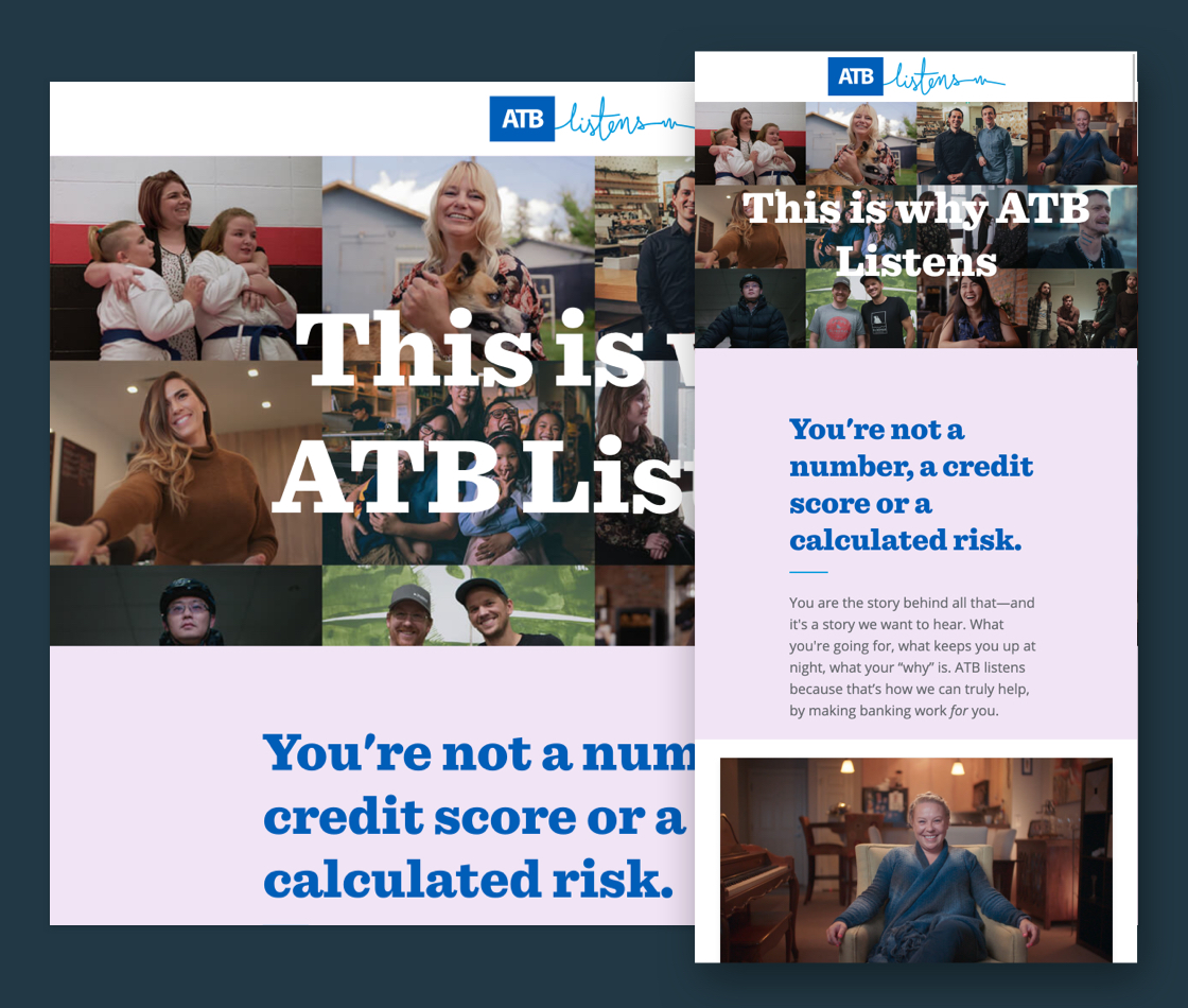
The introductory hero section of the This Is Why web application
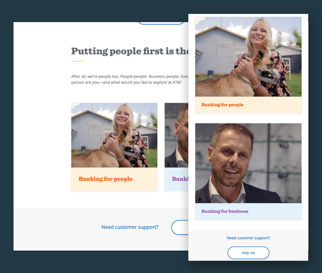
Users were able to select between personal and business experience pathways from the home page.
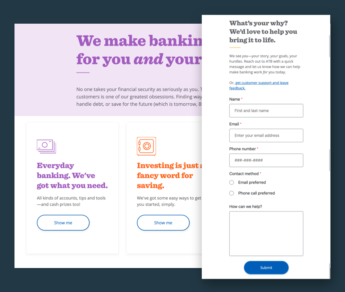
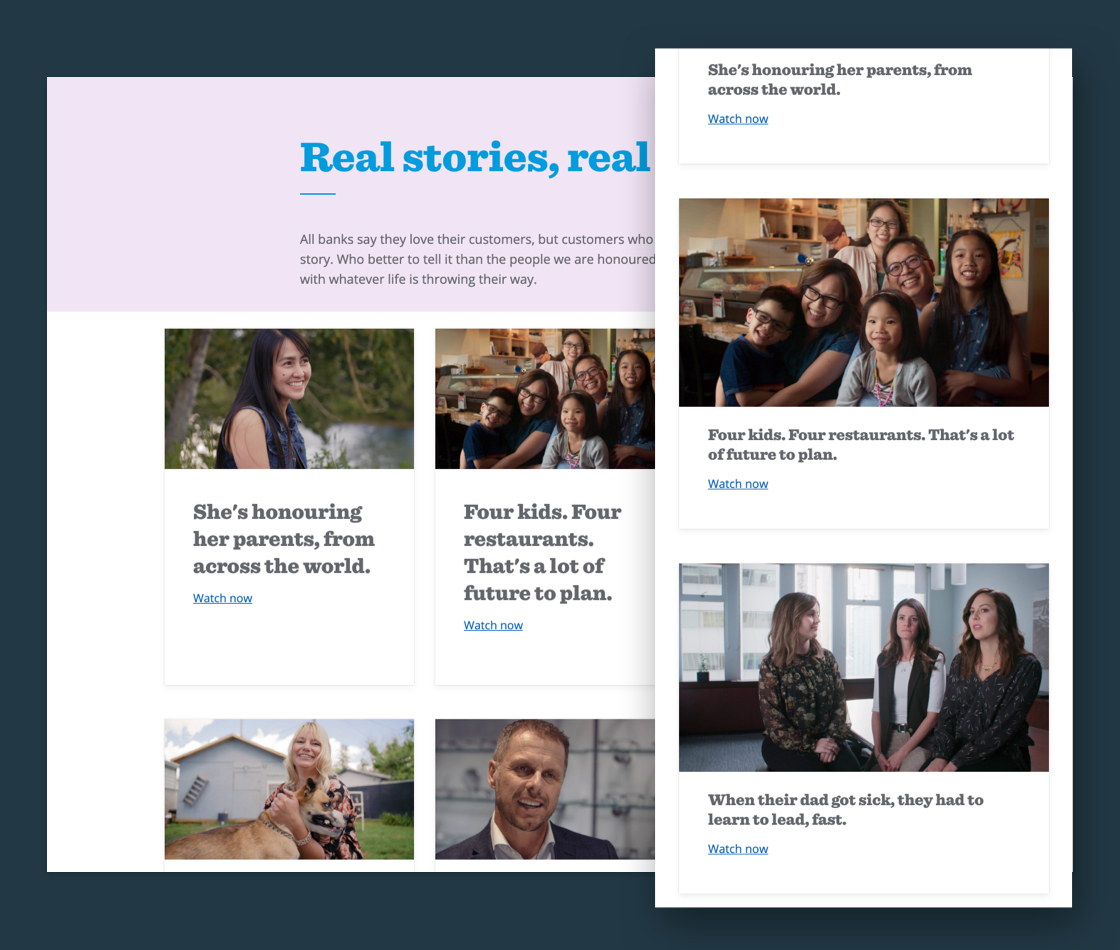
Mid-level pages provided pathways for related products and services, as well as lead-generation form capture for users to connect with ATB’s care team.
Kindness
As an extension of the This Is Why campaign, the Kindness Cards program provided an opportunity for ATB Financial to extend their relationship with the public through acts of kindness. Members of the public were able to receive a Kindness Card randomly from team members, allowing them to redeem $5 at a participating business for a limited period of time.
This single-page web experience served to inform cardholders about the purpose of the campaign, as well as ways in which to redeem their card (through both frequently asked questions as well as a method of contact to the Client Care team, through form submission).
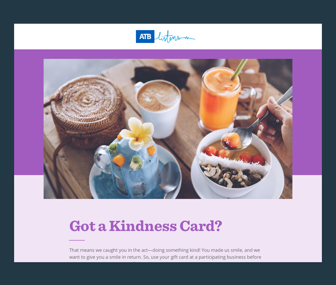
The introductory hero section of the Kindness Cards landing page

Users were able to view each business that was partnered with the campaign, as well as the business’s location
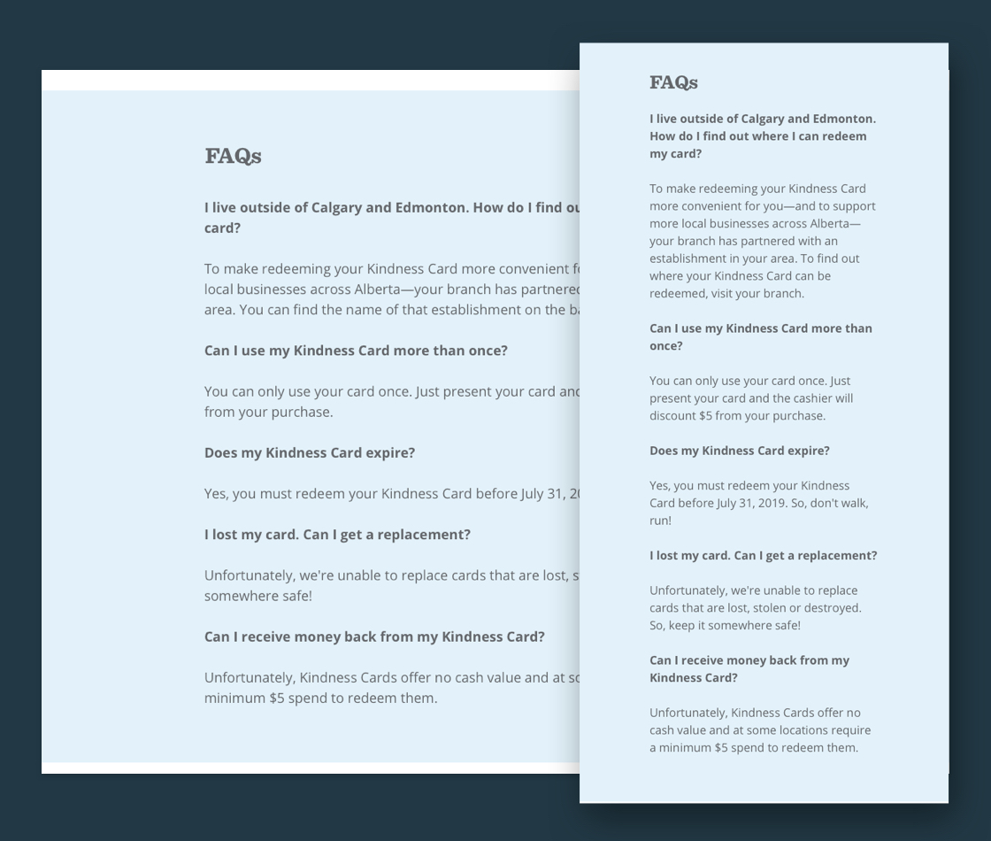
Frequently asked questions were provided to answer any common customer questions relating to the card.
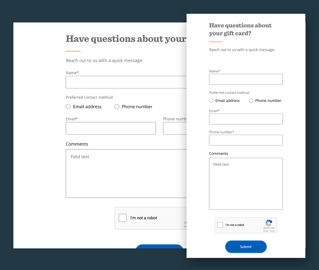
Users were also able to contact the affiliated customer care team for more specific Kindness Card related questions
Teddy For A Toonie
Another extension of the This Is Why web experience included the 2019/20th anniversary edition of ATB Financial’s Teddy For A Toonie Campaign. The campaign helps support and fund mental health initiatives at select hospital foundations across Alberta, through an internal and external month-long fundraising effort.
The online presence for the year’s campaign included information about the selected foundations for that year and their programs, as well as space for members of the public to initiate the donation process. Users were able to select both the foundation they were looking to support as well as their donation amount; their selected information would pre-populate when directed off of this page to ATB Cares, ATB Financial’s donation platform.
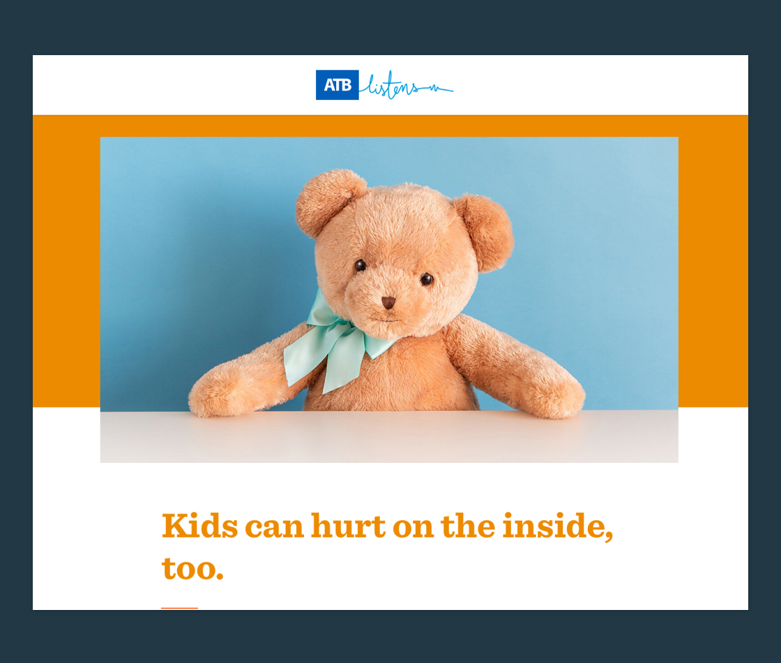
The introductory hero section of the Teddy For a Toonie Campaign
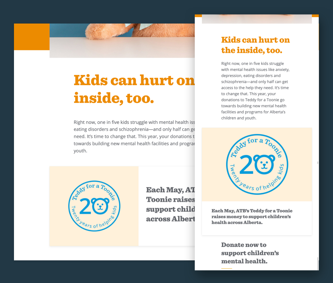
A special emblem featured on the page identifies the 25th anniversary on the campaign (and was featured on other mediums as well)
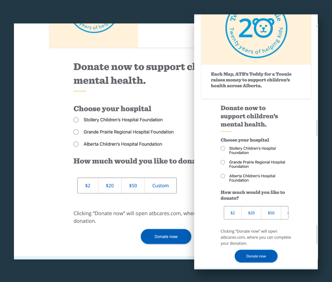
Users were able to select their requested donation amount as well as the foundation they would like to donate to, before proceeding
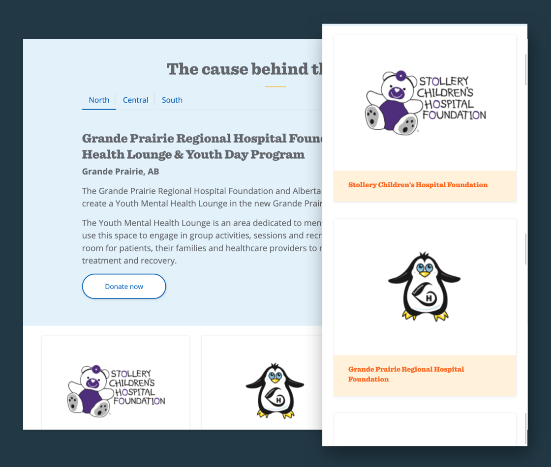
Space was provided to showcase each foundation affiliated with the campaign, including information about the specific causes each donation would be going towards
The Kindness Cards activation and campaign landing page was publicly accessible in June and July of 2019. The Teddy for a Toonie campaign was also active in May of 2019 for the duration of its campaign, before being replaced with a new campaign page hosted on atb.com for the 2020 edition.
Initial concepts and creative direction was provided by Eldon Kymson (This is Why, Kindness), and Jennifer Mendoza (Teddy for a Toonie). Web app development and digital strategy was provided in-house by ATB Financial.
